Brand guide.
How SchoolWised looks and sounds, in every ad, deck and email. The feeling to protect: a busy school office going quiet.
The idea
Scattered dots are the chaos of a school office: papers, files, inboxes. They gather into one mint dot, the calm place. The dot is a brand motif for ads and motion, not part of the logo. Every ad can tell this story in one frame or in ten seconds.
Logo
The logo is the word itself: SchoolWised, written as two parts: “School” in Inter Semibold (tracking -0.045em) and “Wised” in Instrument Serif Italic, in Sage on light backgrounds and Mint on dark ones. It is the same pairing every headline uses. No symbol. Keep the capital S and the capital W, and never set the whole word in one font. Clear space around it is at least the height of the capital S. Use it in Ink on light backgrounds and in Cream on Forest or dark photos. For tiny spaces (favicon, app icon, avatar) use the SW monogram (S in Inter, W in Instrument Serif Italic, Mint) in a Forest rounded square.
Do
- Use the full lockup on cream, white or Forest
- Use the letter S in a Forest square for favicons, app icons and avatars
- Place it on calm, light areas of photos
Don't
- Add a symbol or icon next to the word
- Add shadows, outlines or gradients
- Stretch, rotate or put it on busy imagery
Color
Mostly Cream and Ink. Forest for moments that matter. Sage and Mint are the only accents: Sage on light backgrounds, Mint on dark ones. The app's own blue appears only inside product screenshots.
Rough proportion in any layout: 60 Cream, 20 Ink, 12 Forest, 5 Sage, 3 Mint.
Type
Inter for everything. Instrument Serif Italic for exactly one accent word or phrase per headline, usually the last one. Both are free on Google Fonts.
The school office, simplified.
Voice
Calm, short, plain. Say the pain in the school's own words, then the fix. One idea per sentence. No jargon, no hype, no promises about features that aren't built.
| Write | Not |
|---|---|
| Parents hear about it the same day. | Revolutionize parent engagement with real-time notifications. |
| Attendance in seconds. | A seamless, next-gen attendance experience. |
| Nothing goes out until someone presses Send. | AI-powered automated communications. |
| A parent portal is planned. | Parent portal (coming soon!!) |
Imagery
Editorial photography of real school life: secretaries, teachers, directors and parents in calm, tidy spaces. Soft natural window light, warm oak, cream walls and deep green clothing that echoes the palette. Never staged smiles at the camera, never stock-photo handshakes. Product screens appear in a simple window frame, always crisp, always with the demo school, Brightwood Academy, never real student data.
Ad layouts
Three formats to start from. Each shows one pain or one fix, never a feature list. Every ad ends on the same action: Book a demo.
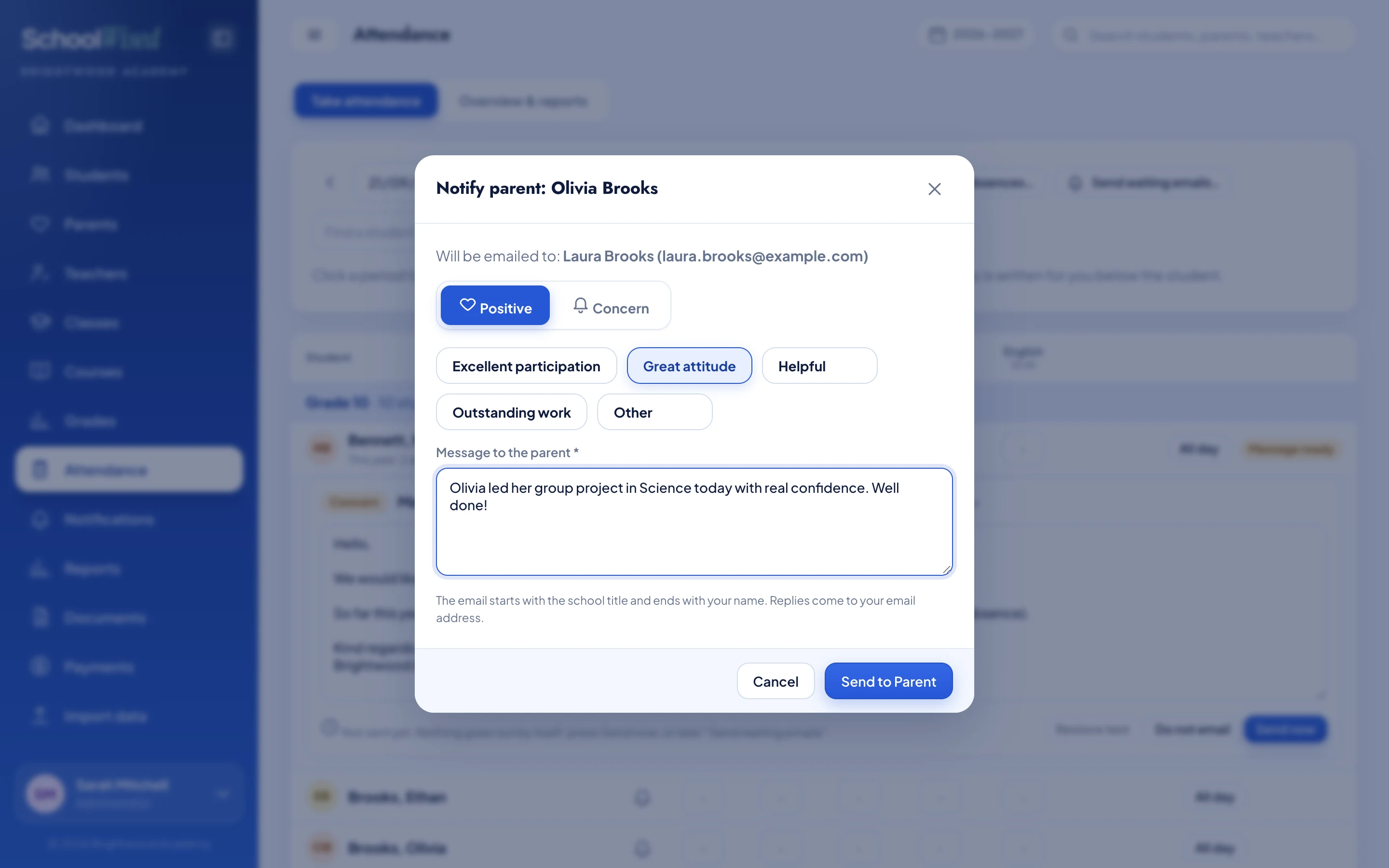
16:9 video or banner: a real moment, the screen that causes it, one caption pill.
Attendance on paper.
Grades in spreadsheets.
Fees in a notebook.
And parents? They hear about it last.
1:1 feed post: the pain, in Cream and Ink.
So your teachers can get back to teaching.
Book a demo9:16 story: Forest close.
Motion
Slow and deliberate, like a quiet office. Things rise a few pixels and fade in, never bounce or spin. Strong ease-out, cubic-bezier(0.23, 1, 0.32, 1). The signature move is the gather: scattered dots stream into one mint dot, which opens like a window onto the product.